How to Make a Business Card
Business cards are one of the easiest and most cost effective marketing tools to create. They can be passed out at networking events, given to potential clients, and they make an excellent first impression of both yourself and your company. Occasionally, business card designs can even double as a company email signature. There are four main things to keep in mind during the project.
Physicality
Before beginning design, you must establish a physical space.
Traditional North American business card size is 3.5x2”. Corners can be rounded or cut at a right angle without having to worry about unique die cuts which gets very expensive quickly.
Business cards are typically printed on a thicker paper such as 14 pt card or cover stock. Will you want a glossy feel or a matte feel to your card? Which best portrays your business?
Starting Design
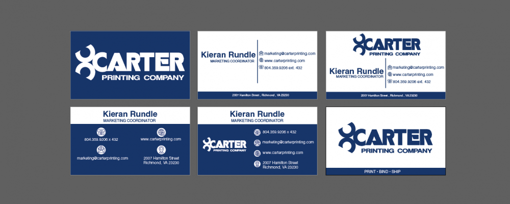
When thinking of where to start, first look at your present branding. What colors do you use on your website or signage? Is your logo intricate or simplistic? What fonts do you use on your products? Will you want a spot gloss on your logo to help it stand out?
Keep the number of colors in use down and stick between one and three for a modern color palette. Choose if you need a photo or not. If you decide to go the photo route, think carefully about what needs to be highlighted most. Is it a picture of yourself for a personal business card? Is it one of your business’ interiors? Do you want something from your portfolio to stand out? Analyze your goals with this marketing tactic to see if it is necessary or not. Many recent designers have cut this for color blocks or simpler graphics instead.
Be sure to include .125” bleeds on all sides of your design before sending it to the printer.
Important Text
On such a small space, deciding what information needs to be kept or cut can be difficult. Avoid putting too much on their or risk it feeling overly cluttered. The purpose is to draw people back to contact you, visit your website, or visit your address.
To achieve that goal, most people choose to include the following:
Name, Company Name, Position Title, Phone Number, Email, Website URL, Social Media, Physical Address
Layout
Utilizing both sides of the card is the easiest way to keep from clumping too many things together and blocking readability. One side can highlight the business name and logo, the other can contain your information.
When blocking out your text and illustration space, utilize techniques with your font to create headers and make sure the text is legible and not too close to the edge. Keep it simple to avoid having your information get lost.