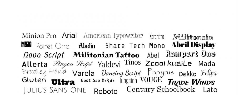
Fun with Fonts
Fonts! They set the tone for your design and publication.
Styles of Fonts:
While fonts can be broken down into dozens of categories, there are four main ones to pay attention to when making your font decisions.
Serif fonts are traditional body types. Examples include Times New Roman and Garamond. At the tips of their letters there are little lines called “feet” that make them especially excellent for smaller type. The feet help with readability even at 8 or 9 pts. They are often seen in printed novels and books.
Sans Serif, meaning “without feet”, fonts are increasingly popular. Google Docs’ go to font Arial and Microsoft Word’s automated font Calibri are both Sans Serif. The lack of lines at the end allow for a sleek and modern appeal.
Script fonts are made to resemble cursive or handwriting. Lucinda and Architect’s Daughter are two common examples. Used for brand headers, cards, and occasional headings they can be a pop of style. Overusing a script font can lead to a design coming off as messy or unprofessional.
Decorative fonts are often software unique or downloadable and vary significantly. They are highly stylized and only work in specific situations. Decorative fonts have small, if any, families and are great for an accent. A medieval style font on a themed restaurant menu or one that drips blood on a Halloween party invitation fit as they enhance the mood of the text.
Things to consider when choosing fonts:
Using more than 3 fonts can lead to a work looking jumbled or feeling noncohesive. Keeping a body font consistent is important for recognition and unity.
Sans Serifs make for great sleek headers whereas serif fonts take the cake for body fonts.
Legibility should come first. If a design is not readable, then it loses all merit and the focus will become that instead of the content. Most designers choose serif fonts for printed readability and san serif for online work though they are becoming more widespread. Using a script or decorative font as a header can be a bold pop that also allows for people to easily recognize what it says.
Font Family refers to how wide a range of options that font has. Serif and San Serif fonts frequently come with a variety including italic, bold, bold italic, and so on. Decorative fonts and script fonts rarely have any options. When choosing a heading and/or body font this can be very important. This can allow for making pull quotes or a variety of headers while still giving integrity to the brand of the piece.
Personality should come through with your font choice. A website for a manufacturing company and one for a children’s book illustrator would have very different choices. While the manufacturer might want to use only one font with a large family to show their modernity, the illustrator might choose to include a marker handwriting font for their headers.
Designing with Fonts:
When you export your file from InDesign or other software, make sure to embed your fonts. If you are sending a printer or other designer a packaged file so they can access the native works, make sure to include a font folder so they can download them as well.
Find a Font:
There are many reputable places to find fonts online and download them. First check and see what your software comes with or if it suggests downloading from somewhere specific.
https://fonts.adobe.com/ has a wide variety that are easy to download and automatically compatible with the rest of the Creative Cloud.
https://www.dafont.com/ is a place to look for quirky fonts that are not found elsewhere.
https://fonts.google.com/ includes many twists on classic fonts with subtle differences to sort through.
